This is a lot of fun until we reach a point in which the swing starts to drop violently at each extreme. At that point, things no longer work as they should. If we ignore this and keep going, we risk crashing to the ground as we have pushed the system to its breaking point.
The lesson from this is that a push at the right time can have an out-sized effect on a system, and if not controlled correctly, it can crash the system. This was bitterly experienced in 1940 when Tacoma Narrows Bridge collapsed due to a a fairly moderate but persistent wind.
Tacoma Narrows Bridge collapsing - Public Domain, Link
This situation, in which energy is fed into a system so that its oscillations become greater and greater, yields a divergent wedge pattern if plotted on a graph. Such patterns indicate that something is about to break. They indicate that someone or something is giving the system a push towards greater extremes at points where the opposite should be taking place. Instead of dampening the oscillations, energy is added to stoke them.
It is therefore worrying that this pattern has been forming in the stock market over the last two years. The S&P index has started to swing between diverging extremes. With every drop, the FED has reacted with policies to push the index up to new extremes. Monetary "energy" has been added at the bottom. Like a parent pushing too hard on the swing, the stock market has been sent higher after every major drop.
We are currently entering a new extreme from which I expect either a violent melt up or a dramatic fall. There is strong resistance upwards at this point. A sudden drop is likely. However, if the FED comes in with a monetary push, things may go through the roof before coming crashing down. Either way, the end result is likely to be a crash.
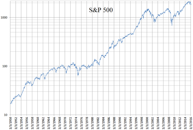
On a longer time scale we can see a diverging wedge developing in the S&P from about 1998 until today. A similar wedge can be seen from 1964 to 1976, after which we got a period of very high inflation, sending stocks crashing down relative to gold. The flat stretch from 1976 to 1980 is in fact a crash with the Dow Gold ratio going from more than 20 to a little over 1.
On a still longer timescale, we have the Dow Gold ratio which has developed a diverging pattern ever since the establishment of the FED in 1913. Here too, there is active management by the FED that pushes things to ever greater extremes.


No comments:
Post a Comment