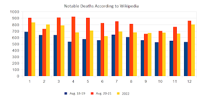
We've entered the second year of what we can term the post-pandemic period, and thanks to Wikipedia and their page on notable deaths, there's no lack of data for us to analyse. Their data is admittedly skewed towards the affluent and well to do. However, this doesn't invalidate the fact that changes in people's general heath will show up in these numbers.
Having looked at other people's work, based on numbers from other sources, I see no significant difference between what I've found in Wikipedia's data and what others have found in other datasets.
What separates my calculations from other people's work is the weight I assign to numbers according to age. I use a simple weighing algorithm that multiplies deaths among people younger than 70 by four and divide deaths among those older than 69 years of age by ten.
I do this in order to filter out noise. Old people die in waves that come and go, and there's nothing unnatural or tragic about this, so I weigh such deaths lightly. However, deaths among people younger than 70 years of age are unusual and often tragic. Such deaths remove many years of life that could have been, and they deserve for this reason to be taken more seriously.
But this weighing has had little impact on my final numbers because the percentage of young people dying hovers around 19% to 24%. Very few data points stand out as unusual. The only notable outlier was April 2020 when the percentage dropped to 17. May and June of 2021 were also unusual with their percentage as high as 26.
 |
| Relative mortality rate of the young from 2018 until today |
The relative mortality rate among the young was 22% at the start of the period and is now 23%. This means that there's been a small drop in life expectancy. However, there's nothing alarming in this. If we remain at around 23% into the future, no-one will notice that there's been a change.
With this in mind, we can take a closer look at the deaths that occurred during 2020 (yellow) and 2021 (green), relative to the two preceding years (blue and red):
 |
| Notable deaths 2018, 19, 20 and 21 |
First thing to note is that the pre-pandemic years of 2018 and 2019 saw deaths hover steadily between 500 and 700.
Next thing to note is that the pandemic didn't have much of an impact before March 2020.
April 2020 doesn't show up as much different from the rest of the pandemic, but total deaths of that month was actually quite high. The raw data shows 1140 deaths, but the low mortality rate among young people during that same month pulls my severity adjusted number down to 900. We were dealing with a severe wave of deaths among old people, which is sad but not tragic.
Starting November 2020, we see deaths rise sharply until January 2021. A number of vaccines were rolled out at that time, and some of them were so harmful that they had to be withdrawn. However, deaths remained elevated through the entire year of 2021. The vaccines didn't result in a drop in deaths as was initially promised, and we are still stuck with excess deaths, as can be seen in the chart below.
 |
| 2022 compared to pre-pandemic and pandemic years |
The blue columns are the average of 2018 and 2019. The red columns are the average of 2020 and 2021, and the yellow columns are numbers for 2022. All numbers are severity adjusted.
The pandemic years are the worst years on average, as expected. However, 2022 should have seen negative excess deaths. With a lot of old and frail people swept away by the pandemic, the population should have been healthier than what it was prior to the pandemic, and we should have seen fewer deaths as a consequence. But the population isn't healthier than before the pandemic. We're stuck in between pandemic and pre-pandemic levels.
This is not how things normally evolve, and the situation is concerning. Not least because the number for January 2023 has come in at 900, which is worse than all previous Januaries, with the exception of January 2021.
No comments:
Post a Comment